Price transparency websites need to be simple, help patients interpret the data, expert says
Judith Hibbard, MD, of the University of Oregon, says the easier it is to understand these databases, the better.

New Hampshire's price transparency website.
As a new report showed the vast majority of U.S. state failing when it comes to healthcare price transparency, one expert has said that for states to get on board they must first take a hard look at the websites they are creating to communicate costs.
On Tuesday, a joint report from the Health Care Incentives Improvement Institute and Catalyst for Payment Reform, showed 43 states failing when it comes to price transparency. Only three states in the country scored high marks, with Maine, New Hampshire and Colorado receiving the only A's.
Many states that didn't make the grade this year could be close to it. For instance, Louisiana and Washington have enacted all-payer claims database legislation, but don't have functioning website yet to publish the data. Once those are in place, and if they are well-designed, you could see very different grades for the states next year.
Judith Hibbard, of the University of Oregon, worked with the groups on the report and said states could take several steps to improve.
[Also: 43 states flunk when it comes to healthcare price transparency, groups say]
Reducing the burden of processing information
"Research shows that processing lots of information and bringing it together into a choice are burdensome cognitive tasks," Hibbard said in the report. "When faced with this type of burden, consumers often make shortcuts in decision-making."
In order to avoid such shortcuts, Hibbard said it is important to think along the lines of "less is more". That means providing less information can actually be more effective because even though the goal is for patients to be informed, if they are given too much info to consider, or if that data is poorly organized, the patient could become overwhelmed. Hibbard suggested giving users a way to narrow their range of options before choosing, limiting the parameters of options being compared perhaps by way of web tools that define options based on user-defined preferences like distance from home and whether a provider in-network or not.
Eliminating comparative information that doesn't help in decision making is helpful, as is removing technical terms and jargon that may be alien to a user and instead employing plain language.
Interpret the data
"One of the most helpful strategies for supporting consumer choice is to interpret the data for the user," she said.
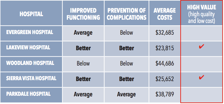
One way to optimize this process, according to Hibbard, is to add "an affective label" that would indicate to users whether a price is good or bad. To counter the possibility that a user might think a higher price means better quality, always pair price information with quality information, she said. That may be as simple as showing the two side-by-side, or a website could present price information within quality tiers.
"Consumers need to see that they don't have to pay top dollar to get good quality. The way the data is presented can highlight this important point for consumers," Hibbard said.
She also cautioned that without quality information to show along with price points, there is a risk that consumers will assume a higher price means better quality and could push consumers to choose high-priced options over lower-cost ones.
Highlight best options
If quality information is coupled with price you can highlight "best value options," she said. This is best done by showing the price and quality information along with the high-value designation. Organizing the information that way allows users to see the reason for the designation.
"Improving consumer choice is a key goal of price transparency. Taking steps to make a report more understandable and useable to a wide consumer audience will mean your transparency efforts will pay off with a greater overall impact," Hibbard said.

Twitter: @BethJSanborn


